Film process

We worked in partners and my partner was Harriet. She used half of the film and I used the other film then we processed our images.

The steps...
  • Entering the dark room with all your equipment and every object put on a table so you can feel what it is and know when to use it.
  • Take out your film from your camera and cut off the ends.
  • Put on your wheel entering a slip on the sides and making sure the silver dots are lined up with eachother then role the wheel around until the film is securely on the wheel.
  • Put into your black tube/canister then a tube so the light can't get in and then lid.
  • Then enter the developer chemicals for about 12-15 minutes shaking every 30 seconds lightly so the chemicals go on each picture of the film.
  • Wash out with water.
  • Then the fix chemicals for about 8-10 minutes and again shaking every 30 seconds lightly.
  • Wash that out with water for about 5 minutes.
  • Then un-do the lid and take out your film strip and hang in the heating film cupboard to dry.

Film

We did another workshop the other day during my photography lesson and we focussed on film. It went really well but it is a very long process!

My theme is texture so I took some pictures of fabrics. I used all different types of fabrics such as netting, velvet, etc. I used a white backdrop as you would for a lighting shoot and used lamps so it was a lighting shoot but instead of digital it was film. I moved the lamps around so I got some shadowing of the fabric such as the net because it had holes so would look different. I also focussed on rule of thirds and close up shots.

Eyelashes inspiration

My inspiration for eyelashes and makeup products for my 1940 John Rawlings shoot would be Maybeline or Max Factor, Rimmel as they focus on these products.

Here is their website:
http://www.maybelline.co.uk/products/134/eyes/mascara/volum-express-the-colossal-cat-eyes/black/1?shadeId=907

John Rawlings 3


I like these photos because of the boldness of the colour. Blue is very bright and sharp but also the style of the coat with the big buttons and the frilly part reminds me of a old-fashioned coat (war coat) which I think resembles 1940's well. I used depth of field and focussed on the button so the other parts were not in focus as much. I actually took the photos outside because I wanted the natural lighting to get the sharp natural effect and not a warm effect.

John Rawlings (mini)

I took a mini shoot of some fake eyelashes resembling the 1940's of beauty.

Casika Shoot 2


These photos are some of my favourites because it resembles my artist very well. Using nude colours such as pale pink and creams. I used a higher ISO to give it more of a grainy effect but not to much so it took the detail out of it. I used the depth of field especially in the first and second photos as you can see it being sharp then blurred behind it makes the photo stand out and look more professional. I also like that the photos look part of a piece of fabric but they're actually my dress.

Cassia Beck shoot 1


This shoot I think has really developed from the start of the man made theme as I wasn't experimenting much with ISO or depth of field. This shoot as you can see focussed on depth of field especially with the second and fourth photo as you could really see the detail in the fabric such as the thread.
I also took some normal photos from far away so you could see the detail of the way the fabric fell such as the ruffles and the detail in the clothing.

Cassia Beck

Cassia Beck is a female photographer I found and her photos seem to focus on pastel colours such as pale pinks/ pastel blue and nude colours. Her photos also have a vintage effect which links in great with my 1940's retro theme. Her pictures aren't based on texture but I will use the colouring and retro theme for my pictures on shoes and vintage clothing/jewellry. I will also try a ISO around 1200 for the grainy effect but not so it takes away the sharpness of the texture of clothing. I also think her photos can be taken with a film camera so this will link into my film piece of work I did in school.


This photo and the other seem like they are taken in film as they dont seem 100 percent clear and have a creamy/white effect over the photo. I will take pictures of the shoes but closer up to show it's texture. Using a white background or a coloured one will make my object stand out a lot more. Using the rule of thirds gives it a different effect instead of it being in the centre.


This photo is very simple and plain but the colour of the tights stand out and taking it of the bottom of the leg comes across a bit different as it comes across more realistic. The pastel colours of grey and pink contrast so I might look at different colours of socks or tights but not close up something like this.

Jasmina Bosnjak

Jasmina Bosnjak uses the photographic technique liquid light, a technique that involves the use of liquid emulsion. This technique allows for the play of coincidence – mistakes and unsuccessful experiments are allowed to become part of the “finished work. Bosnjak focuses on people in her works, and each of them is portrayed with tenderness. The persons seem to be present, not in the world of the photographer, but in their own everyday life. She doesn't follow textures like my theme but I will use Jasmina as a base for my liquid light.


1940's research on fashion

  • 1940 nylon came on to the market
  • 1941 Japanese attack pearl harbour.
  • 1942 t-shirt introduced
  • 1945 US drops atomic bomb on Hiroshima and Nagasaki.
  • 1945 Hitler commits suicide and the war is over.
  • 1945 Bikinis were introduced.
  • 1948 apartheid began.
  • Due to the shortage of the textiles it was easier to make shorter skirts and dresses as less material was needed.
  • Skirts were straight and blouses were plain. Women wore one colour as it was easier to match with other items.
  • Tops featured bows at the front neckline with puffy sleeves. The peter pan collar was introduced 
  • Christian Dior was the designer of the decade. He changed the boyish fashion into a more romantic and softer one. It was nicknamed ‘the new look’
  • Pin up girls were very popular with the introduction of the bikini and the new era laundry.


Liquid Light

In sixth form today we looked at the process of Liquid Light. The process of making it was to cut off some test strips of white paper and I am also going to try some black paper as that will turn white which I think will look quite cool. We had the liquid light which is started off like a gel and it's called SE1 Moltion, then you heat it for about 15 minutes then paint your test trips and your final pieces of paper. You paint it with strokes going horizontal and vertical twice both ways.
After they have dried which takes 24 hours we choose our final image and edit it on photoshop and invert it onto the transparency paper.

John Rawlings shoot 2


I first of all started by taking the pictures close up using a depth of field and a high ISO in some photos but I didn't like that so I kept to a low ISO for the sharpness. I stayed with it being up close and I like these photos because the show the style and colour of the photo really well but the texture being woven and wood like.


These photos I moved onto being further away more like John Rawlings such as linking the colour of the objects to what they were wearing. I added a vignette effect to it and took it in a retro mode which gives it more of an oldfashioned 40-60's effect. The style of the hat being quite big also resembles this and I had a lot of fun taking this shoot and had some great results!

Nathan McCreey

Nathan McCreery is going to be my photographer for my lighting shoot with materials. He began his photographic career while in art school. He studies on black and white but also colour so that would be good to use with my work trying out colour and black and white.
His pictures focus on mountains, architecture but also studio work so he ranges around with what I am looking at. Even his pictures of landscapes and mountains look abstract and different and his pictures look like a low ISO has been used as the photos are sharp and in focus and not with a grain effect.


This photo really captured my eye as the texture of what has been used. It looks like a big sheet of material blowing in wind or from a big fan but then it can also look like a big rock. The lighting has casted great shadows which makes the texture of what ever it is stand out loads so using black and white it can cast this sort of effect so I will look at this when doing my studio lighting shoot.

Lighting Inspiration

http://www.digital-photography-school.com/using-light-to-create-texture-in-your-photography

This website is going to link with my work as I am going to try out a lighting shoot with different types of material showing their textures. I will use different types so velvet, netting etc.
A piece of my material is a net type and I will link this with my Rawlings shoot as not only am I going to use it as just material but also against the face like what he does so getting a different abstract shoot.

Website

This was a website I found which shows the ways of form, texture and design which I think is a great base for my Man - Made theme.
http://justcreativedesign.com/2007/12/24/photography-tips-for-designers/

John Rawlings shoot 1


I chose quite a couple of final pieces from this shoot because I think it went really well! I used depth of field on every picture so I could highlight maybe the lace or the holes. My only negative I have is on the third photo I really like it but I could have maybe used a depth of field more on the lace closer to the lens than further away. I used a retro and monochrome effect on my camera and edited them such as contrasting or sharpening.

1940-1960's inspiration.

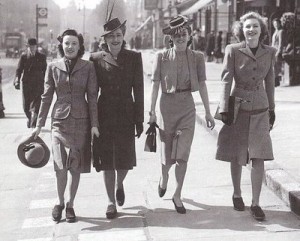
My inspiration for my John Rawlings shoot would be Marilyn Monroe as in thr 1940's and onwards she became the most iconic woman ever by being a curvy blonde with style. This will link with the red lips, curly hair, tights, and the corset/underwear as this works with texture.


John Rawlings

John Rawlings is a fashion photographer from the 1930s through the 1960s and his theme is based on the time he was doing photography. John doesn't focus on texture such as I what I am focussing on but because his photos seem very vintage and oldfashioned, I am going to link with this my work by using the curled hair so looking at textures of hair such as extensions as hair is natural form, big different hats, tights, the black veil with the hat going over the face and a corset as I can look at details of the lace.


This photo has used depth of field which is used quite clever I think as the hat colours link with what the lady is wearing. I will represent this in my shoot by using colours to match the hats but try a depth of field and a bit more closer so I could focus on certain parts of the hat.


I really like this photo as it has used materials in a clever way, I would like to try this as an extended shoot by using it against eyes or lips as you could get the sharpness of the holes against eyelashes or something like that. The shadowing in this photo adds to the mysterious effect aswell so I would definately consider this when I do my shoot.

Man Made theme

My theme through out the Man Made project will be linked to textures of fabrics, clothes, materials as you can get some really nice photos of the different types of materials which have been woven in together but also the feel of the fabric.

Makeup and Fun

For my Sarah Bird shoot it was all linked to emotions and colour. I had experimented with ISO, lighting but I hadn't looked at angles or colouring so I think this was a good thing to experiment with and this was some pictures I took to achieve my shoot.


Another part of girly inspirations were magazines especially Retro/vintage ones. These are some magazines I found experimenting with colour but also emotion/relationships.


Studio Lighting

A photographer wasn't needed for the inspiration of Studio Lighting but Sarah Bird a photographer I have looked at does portfolio natural studio lighting so I could link this in with her work and I think this shoot reflected all types of emotions such as smiling and laughter towards some sort.
We worked in groups of three with one camera and used studio lighting such as the key and fill light. In my sketch book it explains the process what we did and what setting number was the right one for the most equal perfection.


I didn't edit any of these photos as I wanted to keep them as natural as possible from the studio lighting.

Shakespear

Inspiration from Lady Clemintina was the great writer Shakespear. Looking through old plays and pieces of writing with the writing style brought back memories of how they used to dress and what photography was like back then.
When I took the mini shoot of the people during the sculptures shoot as The Albert and Victoria museam it reminded me of old-fashioned times with clothing and if you were rich and poor.
Looking back at past times, when I visited a science museam and found an old-fashioned camera and the writing which goes with it. This is what I found...


Sarah Bird 2 (Michael Robert Williams)


I liked this photo based on emotions from how plain and simple it is. Using the techniques of Michael Robert Williams having black and white statemement photos I love the lighting used in this with the shadowing. A low ISO was used as I wanted the photo to be as sharp as possible and I love the shadowing and warmth on my models neck/chest bone as it is really highlighted from the light.


The lighting used in this photo was right above my model so it highlighted her hair and I took it this angle so it didn't cause any shadows. I kept this photo non-edited because the lighting does the contrast really well from her dark eye make-up to her light blonde hair. The plain background keeps it nice and simple aswell.


Emotion and Relationships

The theme of my Human Form task is Emotion and Relationships so I will associate this by angles, colours, models, facial expressions and lots of others. I think you can relate this with so many things such as family, friends, partners and I will range this by showing different artists and inspirations for my shoots and final pieces.

Sarah Bird 1

All of these photos I took using the inspiration of colour and being quite girly and playful. I found a technique/mode on my camera which was called 'Retro' which I really liked because it got the soft, white and pretty effect. I edited some of them but not very much because it took away the 'retro' look.


This one I edited on Picnik to add to the effect of colour and girliness as it seems as a memory.


Sarah Bird does dramatic colouring and girly photos but she does do natural portfolio/studio lighting so linked in with my other shoot I think this worked really well. This is a completely un-edited photo and I love the way her skin looks and the lighting in this.


This is such a girly photo and my theme running through-out is relationships/emotion and I think this is an aspect of that as she could be on the phone to a friend or a boyfriend. The high angle is a good shot as we can see her laughter and the rule of thirds so we can see her bed-side table and that she is a normal teenage girl.


I cropped this photo because my inspiration from Sarah Bird was colour and I think this resembled it well.


I used the depth of field in this photo so focussing on my models hair and jumper so her reflection in the mirror wasn't in focus.